How we created dark mode on Name.com
Name.com got a whole new look and feel a few months ago when we launched our new brand. But it wasn’t just a new coat of paint that made the site look different. The front-end team leveraged the launch of the new Name.com brand as an opportunity to do a full rebuild and architect the […]
Name.com got a whole new look and feel a few months ago when we launched our new brand. But it wasn’t just a new coat of paint that made the site look different. The front-end team leveraged the launch of the new Name.com brand as an opportunity to do a full rebuild and architect the entire site from the ground up with fresh new templates, CSS, and clean semantic HTML. There were several things we needed to clean-up, some new tech we wanted to use, and there was another reason too:
DARK MODE.
Maybe you missed the announcement at GitHub Universe a few weeks ago, but it’s clear that turning down the lights and giving customers a dark mode option has gone mainstream. Dark mode isn’t just a fad for tech geeks who stare at dark IDE’s and terminal windows late at night in their dim basements. There are quite a few good reasons to consider dark mode, from energy load and environmental impact to accessibility and an opportunity to integrate modern web technologies.
Why we chose dark mode
While our new brand is very clean and bright, it didn’t take long for our dedicated customer base to express their feelings:

We wanted dark mode too. It had been on our radar for a couple of years so when the rebranding project began, dark mode was on the wish list. But we knew from the beginning that we wouldn’t be able to build out the new brand on schedule and on budget while including dark mode—it would have to be added later.
But with dark mode in mind as a future project, we were able to lay the groundwork for an easier integration; namely with smart semantic HTML structure and global CSS classes that could be swapped with a single stylesheet of about 320 lines of CSS (even less when we swap out with CSS Variables).
Taking the time to build the foundations correctly turned out to be a crucial piece of the design that allowed us to add dark mode with significantly less effort and frustration.
Finding a path forward
First, we couldn’t put an invert(0) on everything and call it a day. As a user-focused feature, it’s important to remember that user choice is key. While we wanted the option of dark mode to be available for anyone who wanted to use it, we also wanted to avoid alienating users who prefer a traditional view.
This meant building a toggle for users to decide which mode they preferred, with the added option of a System theme that would automatically switch between the two based on the user’s operating system settings. While more complicated, respecting user choice is a core value for our team and the only way we wanted to see this built.
And second, everything needed to work flawlessly. It was very important that we didn’t have a janky solution that was slapped together. The entire site had to work in any theme: dark, light, or any other array of colors if we decide to add them in the future. This meant countless hours of testing, evaluating, and revising our code until we got it right.
How we did it
Most of creating a dark mode theme revolves around swapping out site colors. This means experimenting and choosing the right combination of background and foreground colors that stay true to the brand while still creating sufficient contrast for readability and accessibility.
There are a lot of different approaches that we could have taken to achieve this. In the end, we felt that instead of modifying any HTML or server-side generated code, we would rather design a system that could elegantly swap colors site-wide based on some simple CSS classes and a few clever tricks.
We had to account for three possible states:
- Light mode: No extra CSS is loaded. This means a lighter page load and a better performance score.
- Dark mode: We default the site to dark by adding .darkmode class to the <body> tag, and swap all CSS styles based on that by loading an extra dark mode stylesheet that’s only 26kb.
- OS mode: This was the trickiest because the user’s setting could be Dark or Light. We don’t know what they want it to be until we detect their setting using @media (prefers-color-scheme: dark) and then swap in dark mode stylesheets.
The nitty-gritty
Here are few technical details about how we implemented site themes:
- We set a new CSS class <body class=”darkmode”> tag for the current site theme. This gives us a way to apply styles using specificity by targeting the children of body.darkmode in our CSS file. This is how we swap background images on some pages.
- We use row striping on several pages, but wanted an easy way to toggle those colors on different themes. The solution turned out to be pretty simple. We use RGBA with alpha channel set to .01 for background and border colors instead of hardcoded hex values, making them toggle seamlessly on dark and light themes.
background-color: rgba(127, 127, 127, 0.1);
- We couldn’t use any inline-styles to set colors on elements, as they needed to be defined by CSS classes so we could swap colors via small changes in a stylesheet. We didn’t use a ton of inline-styles to begin with, but swapping them inline would require more code changes than we wanted to deal with.
- Our SVG icons have a default color but they needed different colors for dark mode. We used a CSS filter property to invert their colors and achieve the same contrast on a dark background. Our more colorful icons were designed during the brand project to work on both dark and light mode, so we didn’t need to tweak them beyond some small adjustments to a couple of colors.
filter: invert(100%) sepia(97%) saturate(14%) hue-rotate(272deg) brightness(104%) contrast(96%)
- Making sure all our images looked good in dark mode was probably one of the biggest tasks. Sometimes we just wanted to swap the image out completely with the <picture> tag and media attribute. This technique works great if you can keep up with the growing image library.
<picture>

<source srcset="dark.png" media="(prefers-color-scheme: dark)">

<img src="light.png"">

</picture>
- In many situations, we wanted to use the same image on different themes, but they just looked too bright on dark mode. So we used the CSS filter property again to “dim” an image so it’s not so bright on a screen.
img {

filter: brightness(.8) contrast(1.2);

}
- Beware of global CSS classes. Most of the images on the site did well with the dimmer turned on, but in some cases, we needed to retain a specific image brightness and contrast so we included a .nofilter class for those specific cases.
img.nofilter {

filter: brightness(1) contrast(1);

}
- 3rd party scripts—like the real-time Trustpilot score on our homepage or the Live Chat with Support button—were a huge headache. While these scripts usually have themes and dark mode options, we had to find a way to trigger those when a user decided they wanted one theme or another. We’re still working on it by swapping js variables and building themes in the 3rd party systems, and that should be fixed up soon.
Why dark mode is important
Dark mode is more than just a personal preference. While a lot of folks might hold strong opinions about dark vs. light (like tabs vs. spaces levels of opinions), there are positive environmental impacts from using a dark theme on your website.
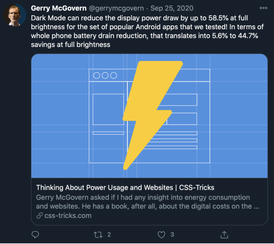
In some cases, dark mode can reduce power draw by more than 50%, extending battery life for mobile devices and reducing the overall energy impact of your site. Multiply that by millions of visitors per year and it’s real, measurable amounts of energy.
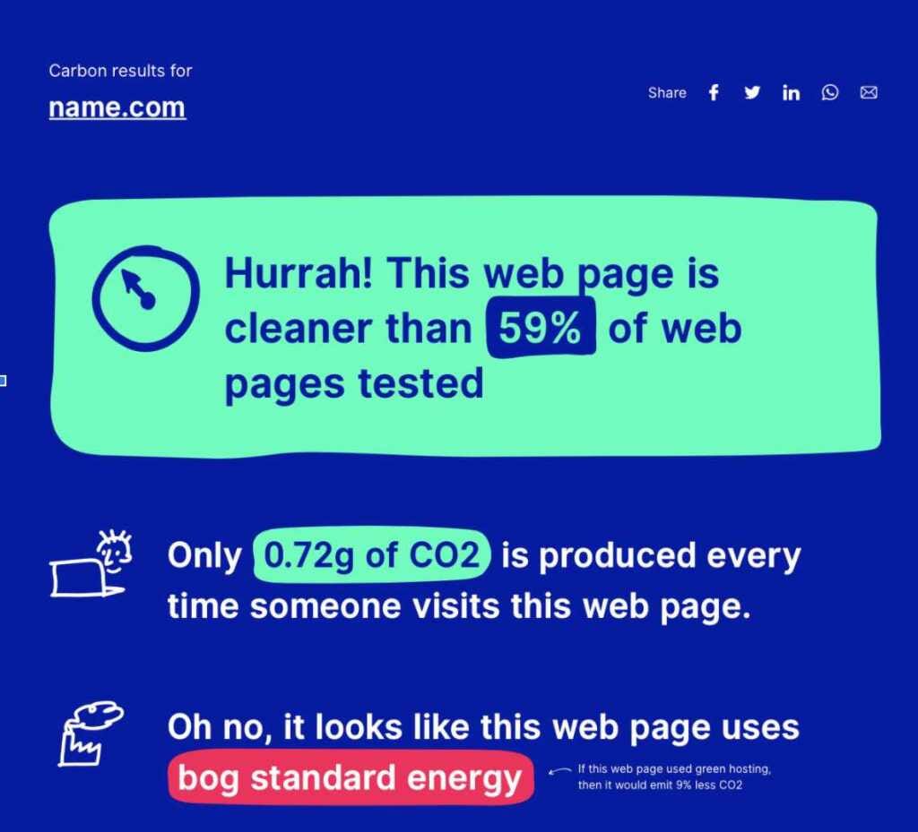
There’s also a real-world environmental cost to running a website. Data centers use a lot of electricity, network traffic and data transmission have real energy impacts, and all that translates to carbon emissions into the air that you and I breathe. You can use a site like Website Carbon Calculator to test your own site and see the impact on the environment, then continue to strive to make it better.
So was it worth it? Yeah, absolutely! As fans of dark mode ourselves we were excited to use it on the site we visit every day. And it looks like a lot of our regular visitors agree. Within the first week, 83% of users who participated chose to turn on dark mode.
If you’re considering implementing dark mode on your website, go for it! We’d love to see what you come up with. Share with us on Twitter so we can check it out.
Resources for building dark mode:
https://twitter.com/steveschoger/status/1151160261170126850
https://css-tricks.com/a-complete-guide-to-dark-mode-on-the-web/
https://stackoverflow.blog/2020/03/31/building-dark-mode-on-stack-overflow/
Dark mode
Let's keep in touch.
You can opt out at any time. By clicking “Subscribe”, you agree that you have read, understand, and consent to the Privacy Policy with regards to the use of your personal data